If you’re here because you’ve recently launched your e-commerce website (or are planning to do so) and want to make sure it gets the traffic you’ve been expecting and striving for, then you’ve come to the right place because that’s what we’re writing about today. Before we continue, you must understand that many factors are involved when trying to grow any website online, so make sure you utilize everything you learn today. We’ve summarized and compiled our knowledge of how to grow your eCommerce website while combing through endless tips and tricks to help you grow your business.
Continue reading to learn how, with a little effort and the use of helpful tools, you can end up on the front page of Google the next time someone, for example, types in the browser words like “buy socks.”
Contents
Use eCommerce Tools
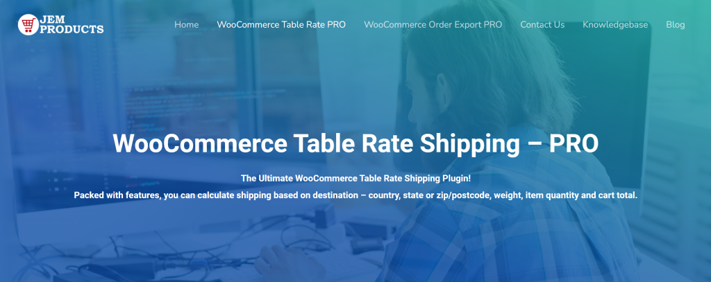
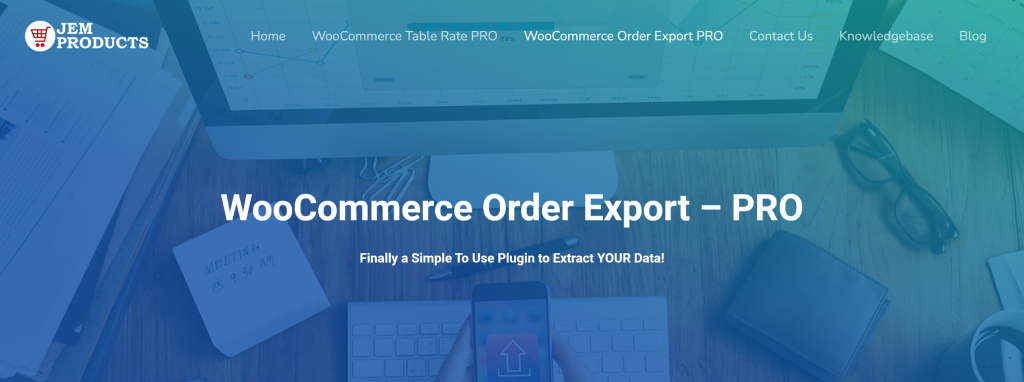
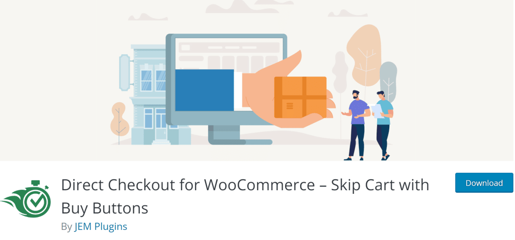
We’ve chosen three must-have plugins that your site shouldn’t be without, WooCommerce Table Rate Shipping, WooCommerce Order Export, and WooCommerce Direct Checkout. Each of them, with its features and characteristics, will provide the right help in the moments when you need it most.
WooCommerce Table Rate Shipping

Let’s start with one of the most time-consuming aspects of running an eCommerce business: shipping. Fortunately, you don’t need an entire team to calculate and come up with shipping prices; instead, tools like WooCommerce Table Rate Shipping can help. One of the fascinating aspects of this tool is the ability to set different prices for logged-in and non-logged-in users. This way, you can encourage more users to sign up for your website because you can lower your shipping costs for those who take the extra few minutes to log in. This can significantly improve your SEO performance on Google, as these pricing incentives give users the impression that they are saving money, encouraging more people to sign up.
WooCommerce Order Export

Exporting data has never been easier than with the help of WooCommerce Order Export. In addition to the given export feature, this plugin also provides several other useful features, such as automatic exports being delivered to your inbox or via FTP, changing the order of columns, or setting up multiple automatic exports, all following your needs. Download the plugin and ensure the site’s success with constant tips and tools.
WooCommerce’s Direct Checkout

WooCommerce’s Direct Checkout is undoubtedly another essential tool. This enables your users to bypass the inconvenient extra step of confirming their order and proceeding to check out with a single click. People do not have the time to click through several pages asking the same question. Take advantage of this, as more and more people tend to leave a website when they see it will take them more than one step to get to where they want to go.
Target Mobile Users
Even though we all still spend hours at our desks, many use our phones more frequently for convenience. You get to lie down before bed and stay up until 3 a.m. browsing online stores for your next impulse buy. Why not optimize your content to provide a better mobile user experience since it works? When designing a website, always put yourself in the user’s shoes. Make sure everything flows with no issues at all because, as previously stated, people do not have the time to figure out how to navigate your website. Keep it plain and simple.
By making your website appealing to mobile users, you are opening yourself to a new world of sales opportunities. A recent study found that an average online user spends up to seven hours behind their screen, so why not ensure your time slot there too? Spend some extra time polishing up your mobile version of your website, and we are optimistic your website traffic will increase in no time. Investing in responsive web design for financial advisors is a strategic move to capture the attention of the growing population of mobile users.
Keep It Minimal
Although there is a niche community that enjoys maximalism, bright colors, and ornaments, you should keep your website as simple and clean as possible to make it easier to navigate. There are many premade templates available, and don’t be afraid to use your creativity to determine what color palette works best with your brand. Of course, simplicity isn’t limited to the overall aesthetics of your website. Your website should also be logical, user-friendly, and organic. Of course, you can follow some general guidelines when determining where each website component should be placed but keep timing in mind at all times.
This entails setting up a series of easy steps to enable customers to purchase from you more quickly. The quicker they click “Buy,” the better your website does in terms of visibility. Your design should flow and appear natural to the user. For example, if you genuinely sell socks, a customer should be able to purchase socks from your site in a couple of clicks after landing on the front page. Make sure your store appears first in Google’s search results by optimizing the descriptions of your products and using high-quality product photos!
Conclusion
Although the topic of growing your eCommerce website is extensive, we’ll put it on hold for the time being. Try gradually implementing the strategies we’ve discussed and watch how your overall performance improves slowly but steadily.
It may require some effort initially, but it will pay off soon. Spend time developing and fine-tuning your website, then sit back and watch your efforts bear fruit. Just make sure you don’t skip any steps because focusing too much on one thing can cause you to overlook other potential issues, so keep your eyes peeled, and you’ll be ready to dominate the online space in no time.

